A Classic American Typeface
2025-06-21
Created by American typeface designer Morris Fuller Benton, Franklin Gothic was first released in 1902 by American Type Founders (one of the best business names by the way). The typeface was named after American prolific printer Benjamin Franklin. Catching a theme here?
An entire book can be written about Morris Fuller Benton and his contribution to type design, and Franklin Gothic is just a small detail in Benton's over-arching story in typeface history.
Where have you seen it?
- The New York Times uses its own version of Franklin Gothic called 'NYT Franklin' for headings, subheadings, and even some larger body copy.
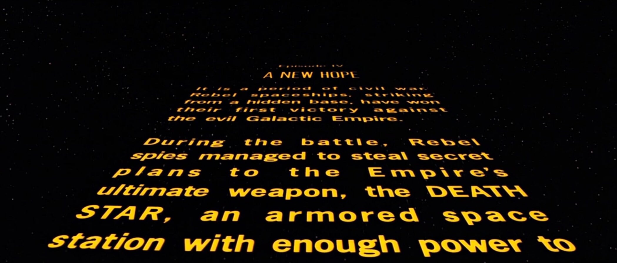
- It was also used for Star Wars: A New Hope, in the title crawl at the beginning of the movie as well as the crediting at the end of the movie.
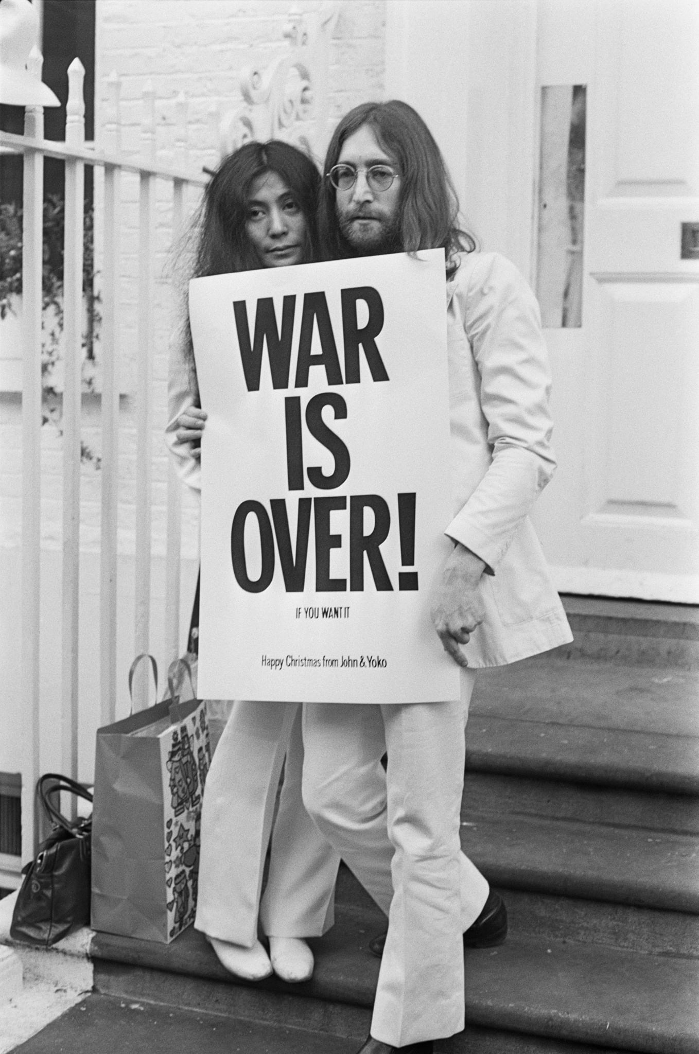
- John Lennon and Yoko Ono used Franklin Gothic in their "War is Over, if you want it" campaign.
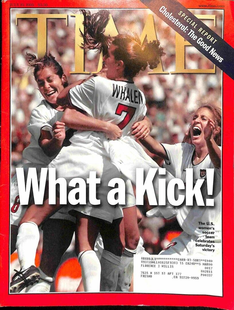
- Time Magazine uses it for their article headlines and the New York Times features it in their editorial copy headlines.
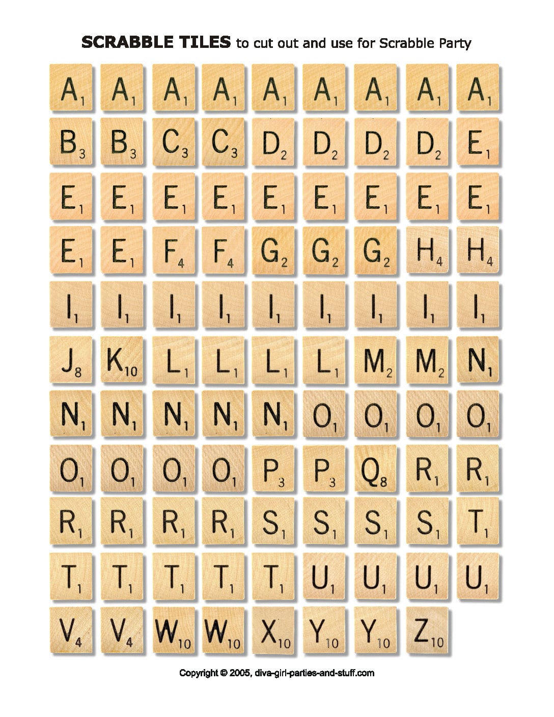
- Scrabble uses the font for their puzzle pieces.
Why does this typeface endure?
With its quick adoption by newspapers and release as one of the first wide-spread metal type fonts, Franklin Gothic became the shared typeface of the American industrial revolution, being used by businesses throughout the early 20th century.
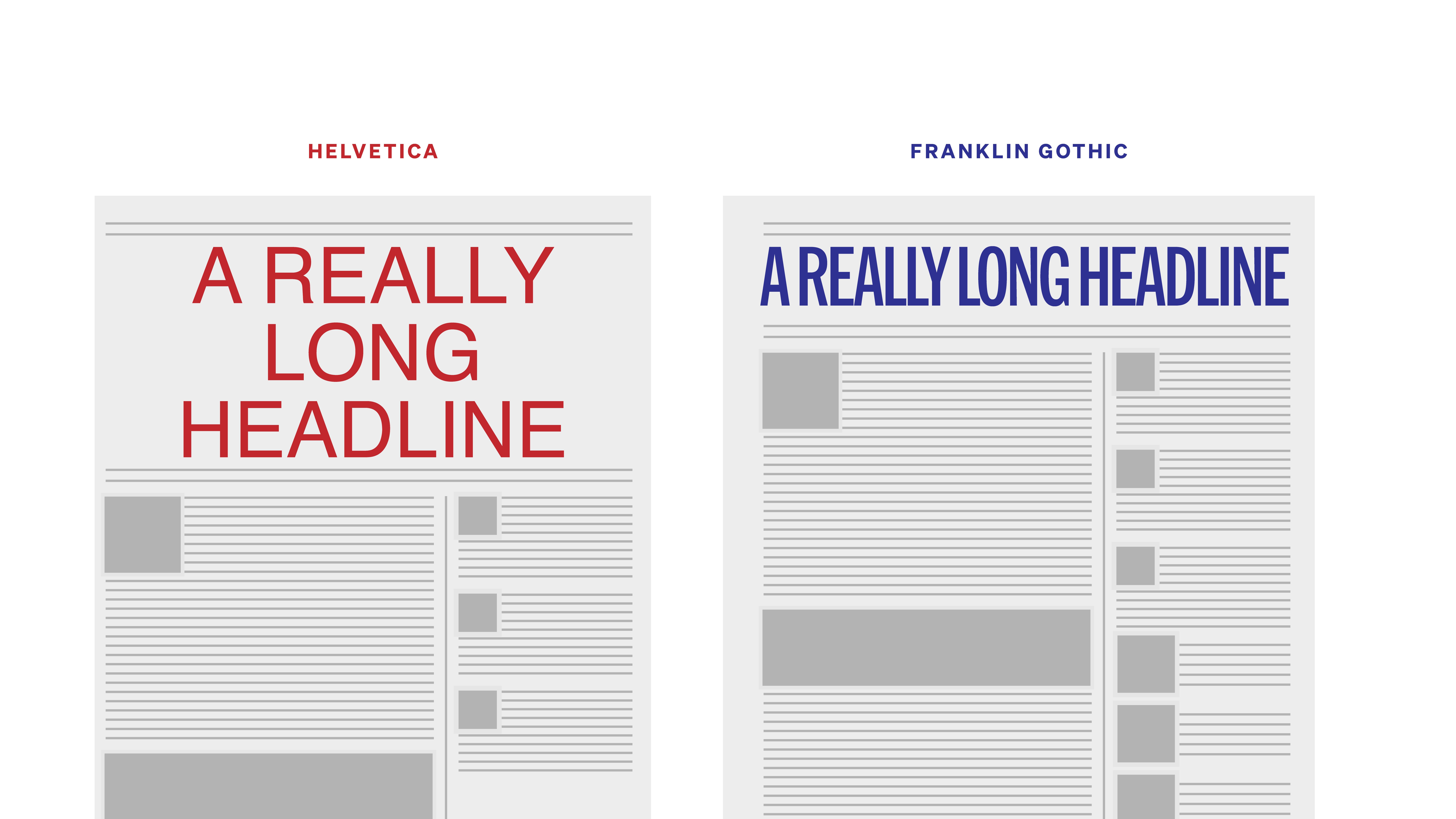
- A perk of Franklin Gothic over 'standard' width typefaces like Helvetica, is that Franklin Gothic comes in narrow widths. That means you can fit more words on a single line with Franklin Gothic as well as more content within your article.
Helvetica was never designed to have that level of functionality and flexibility. Perfect Swiss dimensions where never meant to be squished.
Franklin Gothic's ligatures have just the right amount of personality while being flexible enough to be used for a variety of usages. The letterforms are warmer than Helvetica but just as clean and easily legible. With early newspaper adoption, its functionality-first construction, and unique letterform shapes, Franklin Gothic became synonymous with American expression, invention, and ingenuity in the 20th Century and beyond.
My favorite version of Franklin Gothic
HEX Franklin, noted in my Recent Type Foundry Picks article, is my current favorite version of Franklin Gothic. It's designed by Nick Sherman of HEX Type Foundry and can be found on Future Fonts. The font is the most authentic recreation of the original typeface that came out over one hundred years ago.
Credits
The majority of this information is borrowed from Nick Sherman's presentation about Franklin Gothic and his revival of the typeface he created for HEX, his type foundry. If you are a fan of type, the talk is a wonderful watch and his version of Franklin is a faithful recreation of the original letterforms.